The Role of Visual Hierarchy in Improving Player Engagement
In modern digital platforms, visual hierarchy plays a crucial role in shaping how users interact with content. It determines what users notice first, how they navigate the interface, and how easily they complete tasks.
For gaming platforms in 2026, strong visual hierarchy is not just about aesthetics—it is about guiding attention, reducing confusion, and improving overall engagement.
What Is Visual Hierarchy?
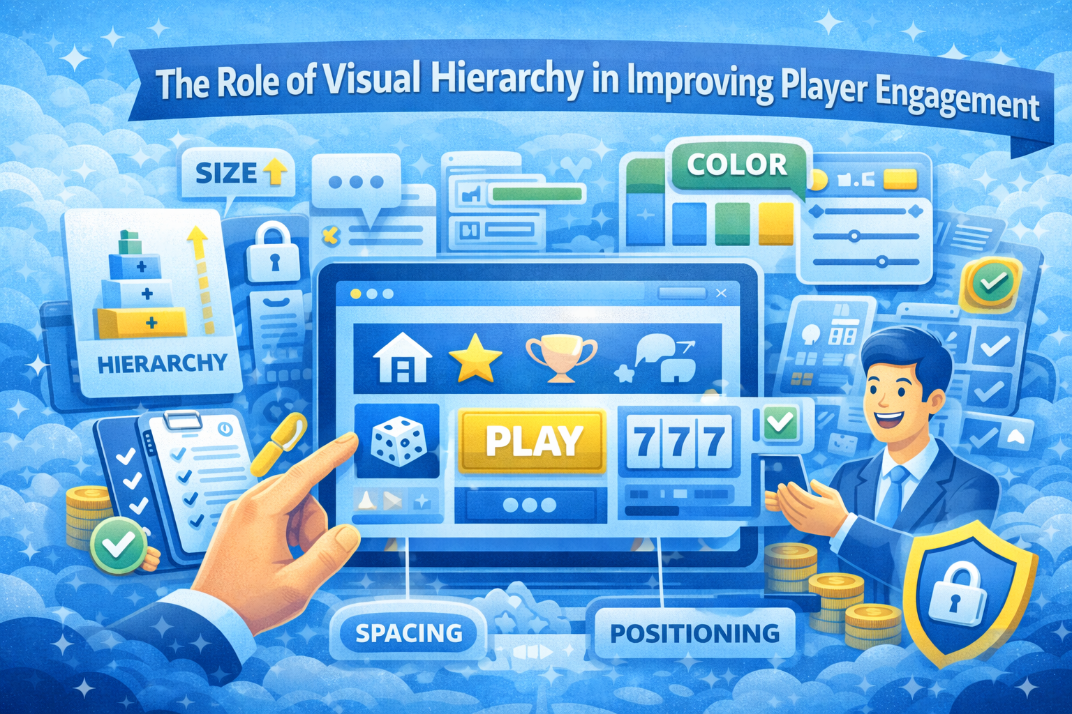
Visual hierarchy refers to the arrangement of elements in a way that prioritizes their importance. By using size, color, spacing, and positioning, designers can direct users toward key actions and information.
Well-structured hierarchy allows users to understand the interface at a glance, without needing to consciously analyze every element.
Why Visual Hierarchy Matters for Engagement
Guides User Attention
Users naturally focus on elements that stand out. A clear hierarchy ensures that important features are immediately visible.
Improves Decision-Making
When information is organized effectively, users can make quicker and more confident decisions.
Reduces Cognitive Load
A well-structured layout minimizes the effort required to understand the interface, making interactions feel effortless.
Key Elements of Visual Hierarchy
Size and Scale
Larger elements naturally attract more attention. Headlines, buttons, and key visuals should be sized appropriately to stand out.
Color and Contrast
Color is a powerful tool for highlighting important actions. High contrast ensures visibility and readability.
Spacing and Layout
Proper spacing separates elements and improves clarity. Crowded layouts can overwhelm users and reduce usability.
Positioning
Elements placed at the top or center of the screen tend to receive more attention. Strategic positioning enhances visibility.
How Visual Hierarchy Enhances Navigation
Clear Pathways
Users should be able to follow a natural flow from one element to another. This reduces confusion and improves efficiency.
Prioritized Actions
Important actions, such as key buttons, should be visually emphasized to guide user behavior.
Consistent Structure
Maintaining consistent layouts across pages helps users build familiarity and confidence.
Common Mistakes in Visual Hierarchy
Too Many Competing Elements
When multiple elements compete for attention, users may struggle to identify what matters most.
Poor Contrast
Low contrast between text and background can reduce readability and accessibility.
Inconsistent Design Patterns
Changing styles or layouts across pages can disrupt the user experience.
Modern Approaches to Visual Hierarchy
Minimalist Design
Reducing unnecessary elements allows key features to stand out more clearly.
Adaptive Interfaces
Platforms can adjust layouts dynamically based on user behavior, improving personalization.
Micro-Interactions
Subtle animations and feedback help guide attention without overwhelming the user.
Performance and usability insights from web.dev highlight how thoughtful design improves engagement and retention.
Balancing Aesthetics and Functionality
While visual appeal is important, it should never come at the cost of usability. Effective hierarchy balances design with function, ensuring that users can navigate the platform easily.
Design choices should always serve a purpose, whether it is guiding attention, improving readability, or enhancing interaction.
Building Interfaces That Feel Effortless
When visual hierarchy is implemented effectively, users do not need to think about how to navigate—they simply follow the flow.
This creates a smoother, more enjoyable experience that encourages longer engagement and repeat visits.
Ultimately, visual hierarchy is not just a design technique—it is a fundamental part of creating intuitive and user-friendly platforms.